The human mind perceives more than you might be aware of seeing. Our environment affects our emotions as images result in messages to our subconscious mind, having a profound effect on our brain function. That is true in the ballroom and in the hotel room.
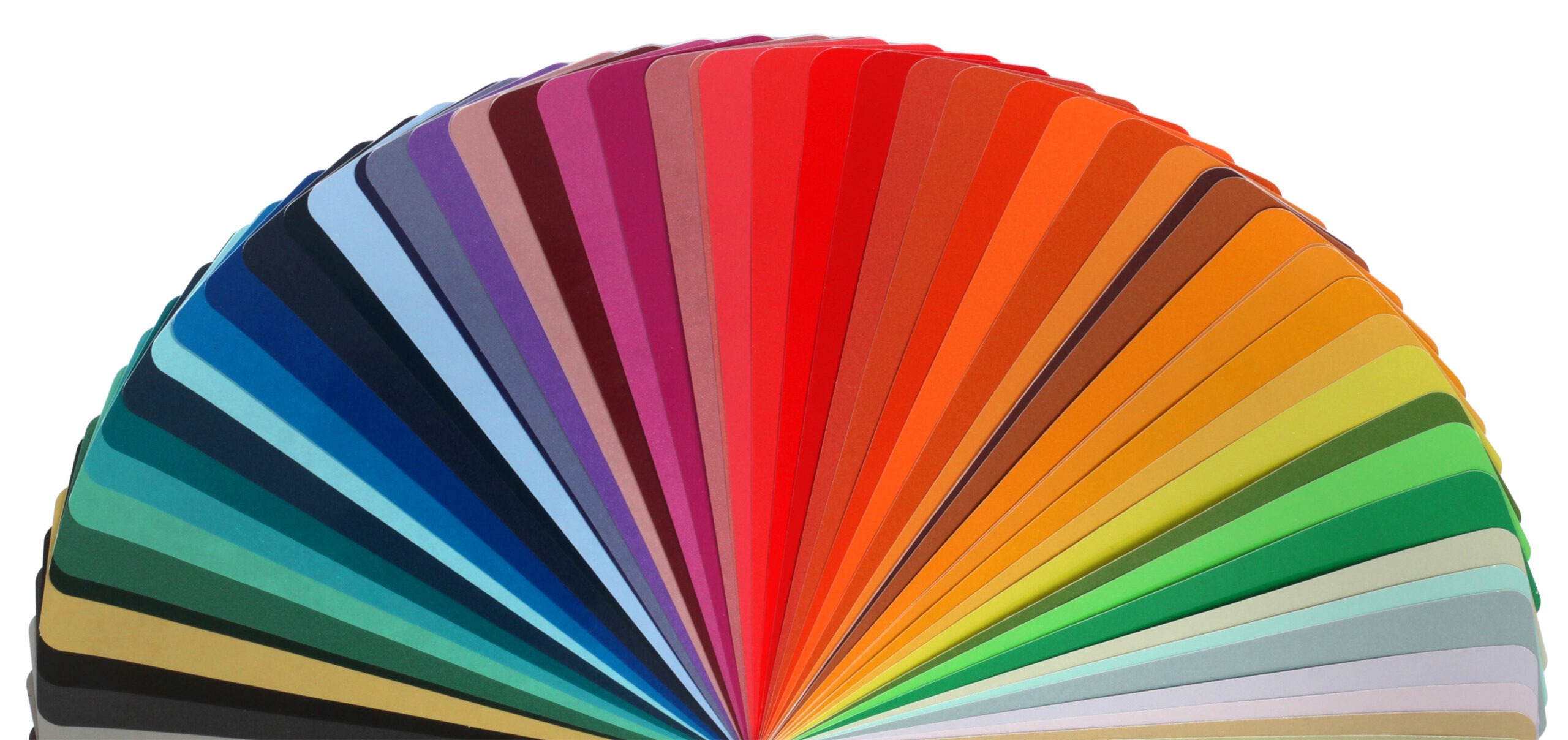
Colors, in particular, are a powerful tool for communication. As an event professional, understanding the psychological impact color can have on your attendees is essential. It can affect their moods and productivity and can also create a positive or negative experience. Your choice of color also contributes to your event’s success. Before you get the color wheel spinning for your next event, here are a few things that can help you strategically choose your theme.
Define Your Goals
Make sure you have established your event goals. What do you want to achieve at your event? Is it a networking event? Do you want your attendees to participate and engage with you? What emotion do you want to induce? Are you looking to persuade your attendees, or is it a formal meeting promoting your business and its brand? Once you have determined your objective, you can focus on the psychology of color that can help set the tone for your meeting.
Read More: Spectacular Spaces: Event Design with Ed Libby
Know Your Audience
Understand your group before you pick a color. Don’t just implement a color palette into your event because it aligns with your objectives. Different people respond to colors differently.
Colors also mean different things in different cultures. If you are planning your event at an international location, look out for what each color means in that culture. For example, black in Japan is considered a modern and stylish color, but in India, black represents death. In many parts of the world, green represents serenity and strength, but in China it represents infidelity, and in Latin America, it represents danger or death.
Know the Trend
Mocha Mousse, described as “a mellow brown infused with sensorial and comforting warmth,” has been selected as Pantone’s Color of the Year 2025. It is a perfect addition to a palette of warm neutrals and evokes a sense of luxury and refinement. If you’re looking to add a touch of Mocha Mousse to your event, consider cream-toned floral arrangements set in a mocha-hued vase or neutral tablescapes with mocha-colored linens.
Read More: How Color Can Be Your Next Secret Weapon to Earn Audience Engagement
Pantone selects their Color of the Year by studying the entertainment industry, new artists, fashion runways, popular travel destinations and modern lifestyles. This doesn’t mean you must incorporate the trending color, but if your event’s objectives align with the emotion associated with the color, then why not?
Monochromatic Color Schemes
Monochromatic color schemes are derived from a single base hue extended using its shades and tints. For instance, if you are planning to use yellow as your theme, you can use all the different shades of yellow, with industrial bulbs, sunflowers, golden drapes and more. This lets you concentrate on just one color, and you can make it interesting with different patterns, shapes and textures.
Avoid a Competing Color Palette
If you are choosing more than one color hue for your event decor, employ contrasting colors and not competing colors. While contrasting colors can be soothing, competing colors are simply distracting for an audience. Some competing colors to avoid are yellow on green, purple on green, blue on red, red on purple, green on red and red on black.
Colors, Emotions and Events
Colors in the blue and green family tend to have a calming effect on the senses. Both of these colors slow the audience’s heart rate, body temperature and blood pressure, causing people to feel relaxed and calm. If you want to create an attention-grabbing, high-energy event, then red is the color. Research shows that red excites the nervous system, increases brain wave activity, and increases blood pressure and heart rate.
Orange promotes energy and excitement. It creates a playful and happy environment and encourages verbal expressions. Purple has a calming effect on the senses. Purple is also ideal when your event’s goal is a peaceful ambiance.
Yellow leads to a cheerful, optimistic and alert audience. Yellow increases metabolism and is also known for its mood-enhancing abilities. Black is known for sophistication and power. Not recommended for business meetings unless it is a black-tie, high-end event. White is the color of purity that creates a sense of space. If you are hosting your event in a smaller venue, white can help make it feel more expansive.
This article appears in the January 2025 issue. You can subscribe to the magazine here.