The human mind perceives more than you might be aware of seeing. Our environment affects our emotions as images result in messages to our subconscious mind, having a profound effect on our brain function. That is true in the ballroom and in the hotel room.
Colors, in particular, are a powerful tool for communication. As an event professional, understanding the psychological impact color can have on your attendees is essential. It can affect their moods and productivity and can also create a positive or negative experience. Your choice of color also contributes to your event’s success. Before you get the color wheel spinning for your next event, here are a few things that can help you strategically choose your theme.
More: Resorts Use Color, Sounds and Nature to Rejuvenate Guests
Define Your Goals
Make sure you have established your event goals. What do you want to achieve at your event? Is it a networking event? Do you want your attendees to participate and engage with you? What emotion do you want to induce? Are you looking to persuade your attendees or is it a formal meeting promoting your business and its brand? Once you have determined your objective, you can focus on the psychology of color that can help set the tone for your meeting.
Know Your Audience
 Understand your group before you pick a color. Don’t just implement a color palette into your event because it aligns with your objectives. Different people respond to colors differently. Consider if your attendees are mostly male or female. This can influence your color choice as well.
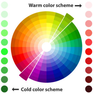
A study by Hallock reveals that women favor soft colors, such as pink and purple, and men prefer bold colors—blue, red and yellow. While women prefer tints (colors with white added to them), men lean more towards shades (colors with black or grey added to them). However, both genders prefer the color blue.
Read More: Bright Event Furniture Ideas
Colors also mean different things in different cultures. If you are planning your event at an international location, look out for what each color means in that culture. For example, Black in Japan is considered a modern and stylish color, but in India, black represents death. In many parts of the world, green represents serenity and strength, but in China it represents infidelity and in Latin America, it represents danger or death.
Know the Trend
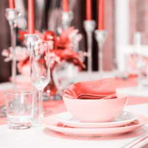
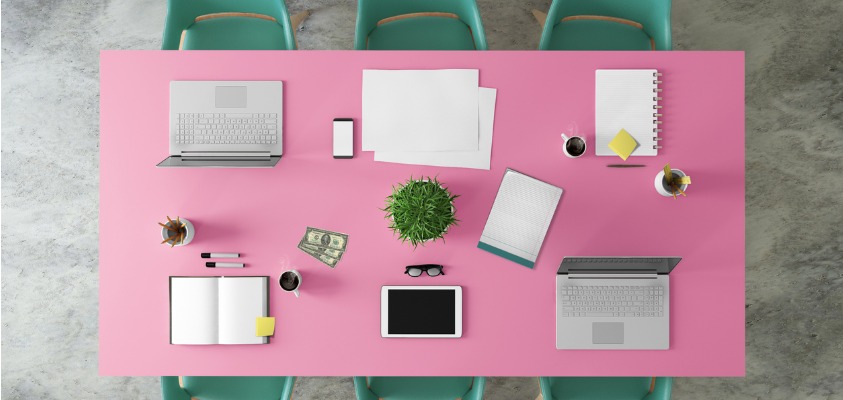
Every year, Pantone releases the color of the year. For 2024, the color is Peach Fuzz, a a velvety gentle pink tone that captures the desire to nurture ourselves and others. This color is based on a study for new color influences that include hues used by the entertainment industry, new artists, fashion runways, popular travel destinations, as well as modern lifestyles.
This doesn’t mean you must incorporate the trending color, but if your event’s objectives align with the emotion associated with the color, then why not?
Monochromatic Color Schemes
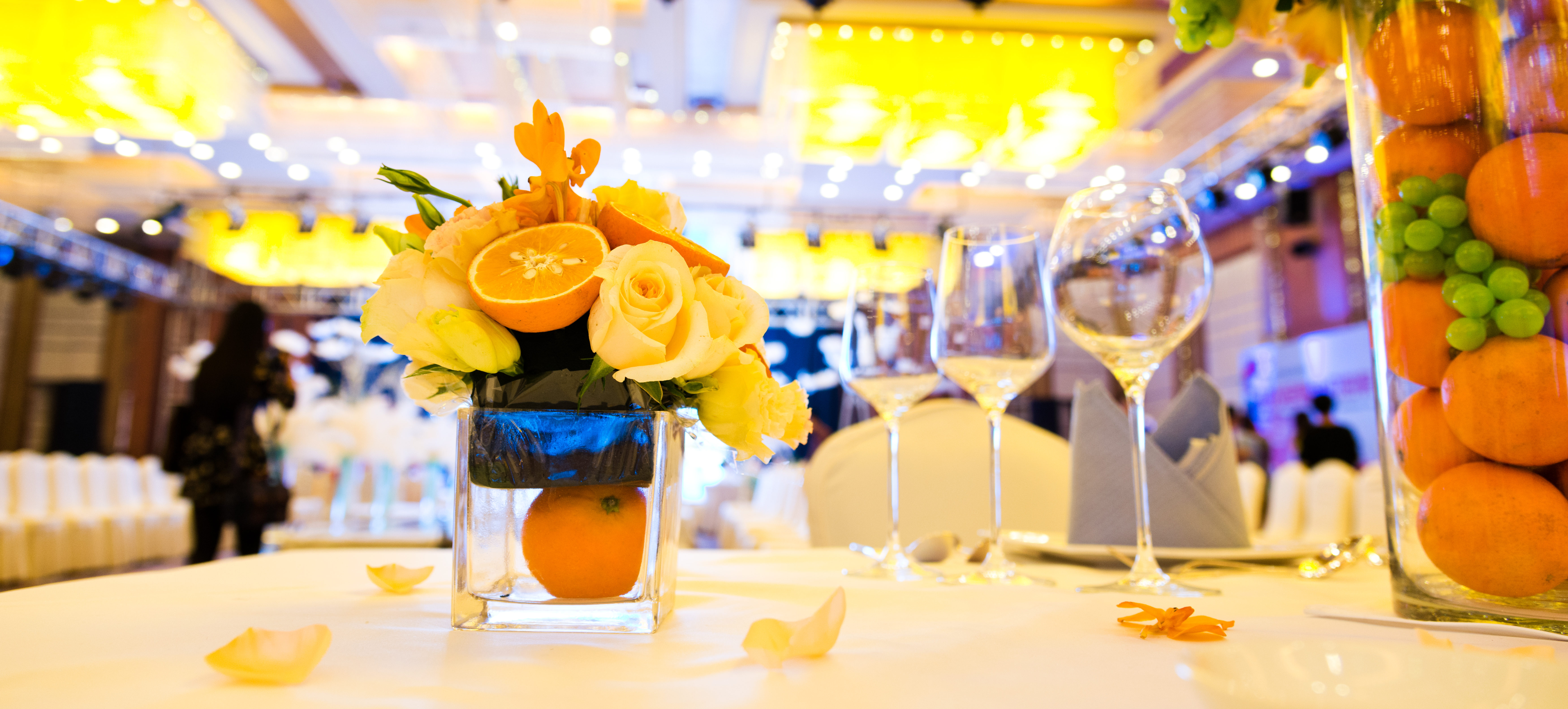
Event planners love to use more than one color when deciding on themes. You don’t always have to look for complementing colors. Even monochromatic colors bring out the best emotion. Monochromatic color schemes are derived from a single base hue extended using its shades and tints.
For instance, if you are planning to use yellow as your theme, you can use all the different shades of yellow, with industrial bulbs, sunflowers, golden drapes and more. This lets you concentrate on just one color and you can make it interesting with different patterns, shapes and textures.
Read More: 5 Seasonal Event Decor Trends
Avoid a Competing Color Palette
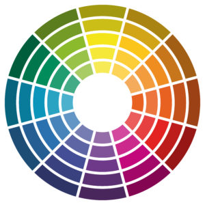
If you are choosing more than one color hue for your event decor, employ contrasting colors and not competing colors. While contrasting colors can be soothing, competing colors are simply distracting for an audience. Some competing colors to avoid are:
- Yellow on green
- Purple on green
- Blue on red
- Red on purple
- Green on red
- Red on black
Colors, Emotions and Events
Blue and Green: Colors in the blue and green family tend to have a calming effect on the senses. Both of these colors slow audience’s heart rate, body temperature and blood pressure, causing people to feel relaxed and calm. Green particularly promotes balance between the body and mind and relieves stress. It’s the color to reach for when you need to inspire innovation and boost creativity at an event.
Red: If you want to create an attention-grabbing, high energy event, then red is the color. Research shows that red excites the nervous system, increases brain wave activity, increases blood pressure and heart rate. If you want to keep your attendees moving at the event, go red!
Orange: This color promotes energy and excitement. It creates a playful and happy environment and encourages verbal expressions. If your event requires collaboration, working in groups or brainstorming, orange is your color.
Purple: An exotic color that can infer royalty and wisdom. It is most commonly associated with women and has a calming effect on the senses. Purple is also ideal when your event’s goal is a peaceful ambiance.
Yellow: Leads to a cheerful, optimistic and alert audience. Yellow increases metabolism and is also known for its mood-enhancing abilities. If you are planning a lunch event with a goal to increase productivity, it’s yellove!
Black: Known for sophistication and power. Not recommended for business meetings unless it is a black tie, high-end event.
White: The color of purity that creates a sense of space. If you are hosting your event in a smaller venue, white can help make it feel more expansive.
